At Casa y Deco, we love seeing how wallpaper has regained prominence in today's interiors. But I confess that when the trend started, I saw too many homes that ended up "covered" in patterns, vibrant colours, and textures that screamed from all four walls. The real challenge is not daring to use wallpaper, but doing it intelligently so that the space breathes and feels welcoming rather than claustrophobic.
The first thing we've learned through our mistakes is that not all wallpapers work the same in every room. A bedroom doesn't ask for the same treatment as a living room or an office. If you look at an intense floral wallpaper in a small room with no natural light, the effect will be overwhelming. The same wallpaper in a large room with wide windows and balanced indirect light can be a gem. The equation is simple: the more natural light and square footage, the more freedom you have for bold patterns.
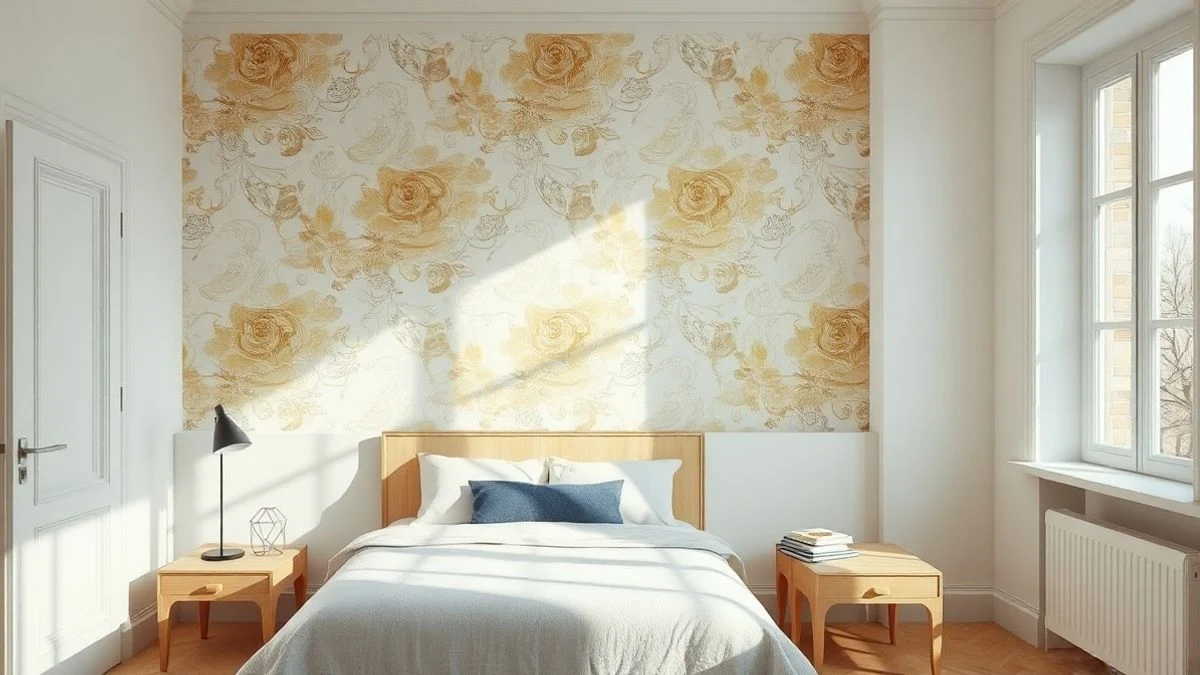
The golden rule we follow is to wallpaper only one wall. Yes, it seems obvious, but it's incredible how many people believe that if they like wallpaper, they should put it everywhere. A focal wall, with a design you love, surrounded by smooth walls (preferably in white, cream, or a neutral colour that complements), multiplies the visual impact without overwhelming. That wall becomes the star, a point of interest, without the eye getting tired searching for a place to rest.
Now, choosing which wall that is requires a bit of strategy. The headboard wall in a bedroom is almost always a safe bet: it's there, it's large, you see it upon entering, and it creates a psychological wrap that feels almost like a hug. In living rooms, the wall behind the sofa or the one at the back (opposite the entrance) works very well. In kitchens and dining rooms, the wall where the table or island is usually perfect. What doesn't work is wallpapering side walls where there are doors, fragmented windows, or a lot of dead space: you take away prominence and only visually divide the space.
A crucial decision is the type of pattern and its scale. If you have a space of about 20 square meters, a small and very dense pattern (like certain toiles or Liberty) can look like a visual mosaic that tires the eye. A large and breathable pattern, even if complex, usually works better: less repetition, more clarity. If you prefer a delicate pattern, choose one where the background (the base colour) is as important as the design. This allows the eye to breathe between motifs.
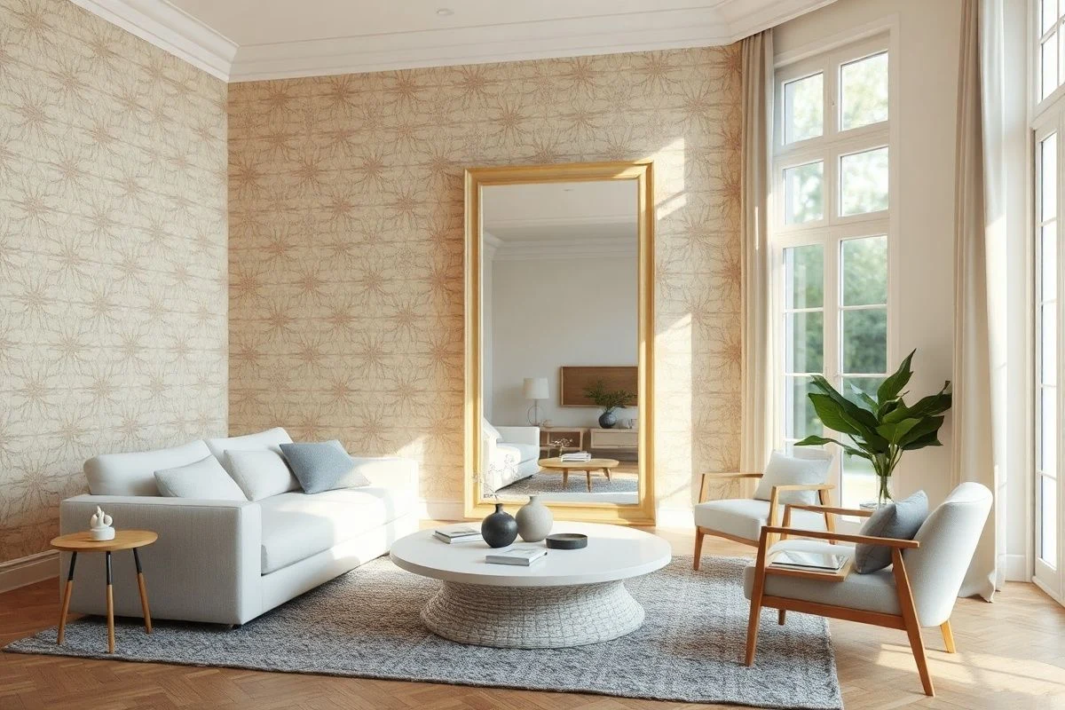
Background colours are your silent ally. Wallpaper with a white, cream, or light grey background always adds psychological spaciousness, even if the pattern is bold. The same wallpaper with a dark background (black, navy, burgundy) contracts the feeling of space. It's not that we don't recommend it; just that if you use it, do so in spacious rooms or as a very specific accent, because the risk of it feeling suffocating is greater.
A trick that personally saved me in a somewhat dark bedroom was combining wallpaper with a mirror. We placed a large mirror on the wall opposite the one with wallpaper: the light bounces, the pattern reflects, and the feeling of heaviness is almost nil. It's the closest thing to tripling the brightness without renovation.
We've also seen that wallpapers with geometric or abstract patterns — without too much figurative representation — age better than very specific thematic ones. A wallpaper with lines, organic shapes, or an abstract repetitive pattern allows you to change the decor, furniture, and bedding without suddenly making your bedroom look like you took everything from a seasonal store three years ago.
Light is crucial. Wallpaper under intense natural light looks completely different than under warm artificial lighting. If you have the choice, observe a sample of the wallpaper in the room at different times of the day, with and without artificial light on. It may seem exaggerated, but believe me, your wallet and mental health will thank you later. We've seen transformations from horrible to beautiful simply by modifying the temperature and amount of light.
Another thing that matters a lot to us is not to overdo the texture if the pattern is already complex. If your wallpaper already has a dense and detailed design, the rest of the room should breathe: clean furniture, simple lines, neutral textiles. If you add a patterned curtain, a wallpaper in another area, a piece of furniture with elaborate carving, and a rug with detail, chaos is served. Less is more when there is a star element.
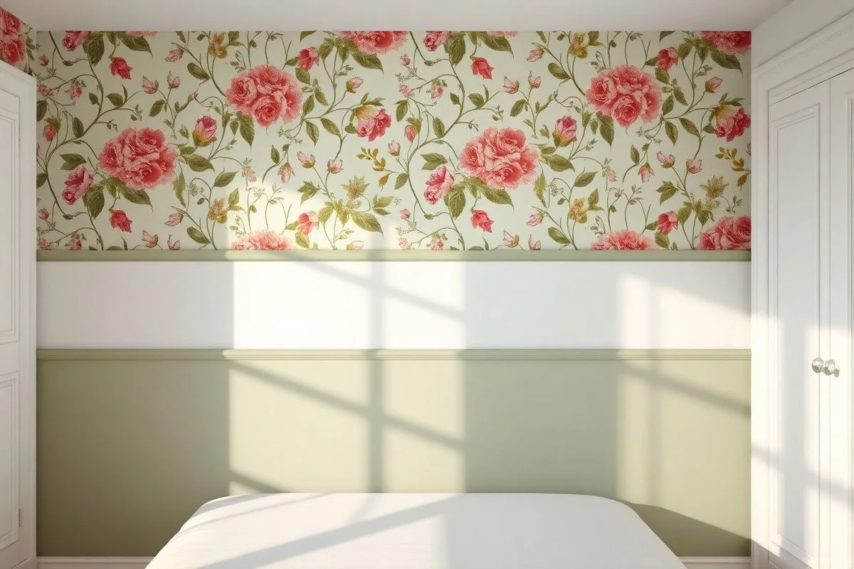
The combination of wallpaper with a skirting board or a painted panel works very well for visual delimitation. It’s not necessary to wallpaper from top to bottom; you can stop the wallpaper at mid-height (about 120-150 centimetres) and leave the lower area with a smooth paint in a complementary tone. This recreates those British early 20th-century environments that have such elegance, and it also saves you wallpaper (which isn't cheap).
In living rooms where different uses coexist, wallpapering the relaxation area (sofa and television) allows for a more sober dining or work area. You visually segment the space without physical barriers, just with colour and pattern. We've seen this work perfectly in 40-50 square meter apartments where flexibility is key.
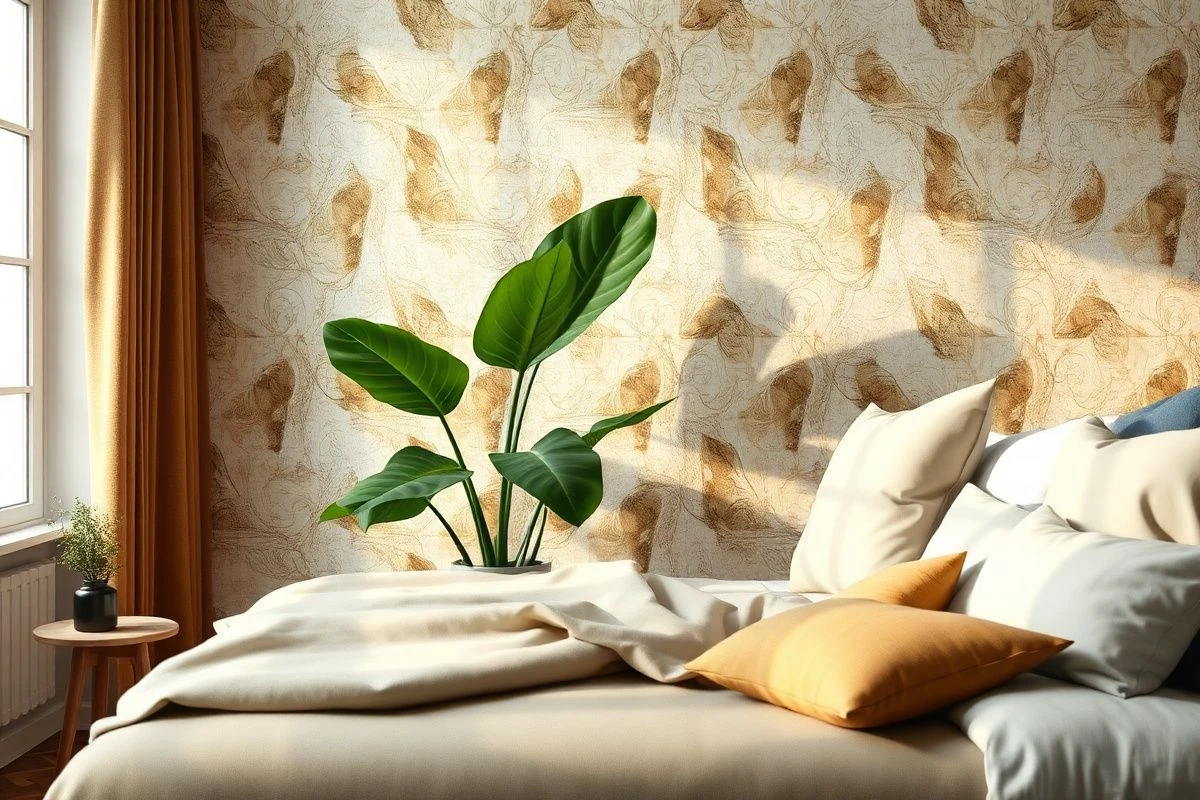
Something that surprises many people is that wallpaper and plants coexist wonderfully, as long as the plant doesn't cover most of the pattern. A large pot in the corner of the wallpapered wall, or a frame of plants around, softens the feeling and anchors the wallpaper in the living reality of the home. There’s something about seeing a real green leaf next to a pattern that relaxes the "gift wrap" effect.
Finally, if you have doubts about whether the wallpaper will be too much, there’s a simple home test. Get a large sample (not a 10x10 strip, but something at least 60x60 centimetres) and temporarily stick it to the chosen wall with painter's tape. Live with it for a week or two. Look at it at different times, invite people to give their opinion without biasing them with your enthusiasm. That will tell you more than any conversation with a decorator, because wallpaper is a long-term decision that should make you happy every morning when you open your eyes.

You may also like