At Casa y Deco, we love talking about colours because, let’s be honest, they are the most economical and transformative change we can make in any space. While changing furniture requires investment, planning, and sometimes even hauling heavy items up the stairs, a can of paint costs little and the impact is immense. This year is packed with colour trends that go far beyond the pristine white and neutral grey that have dominated in recent years. The colours that will define 2025 are bold, emotive, and, best of all, accessible to anyone willing to wield a brush.
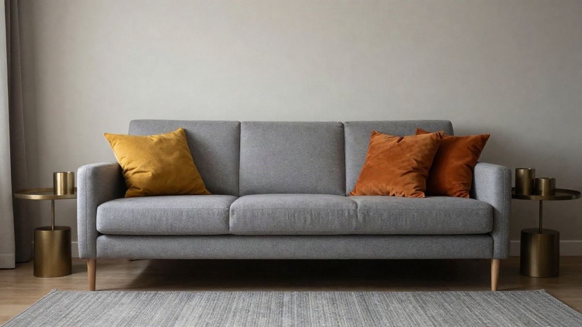
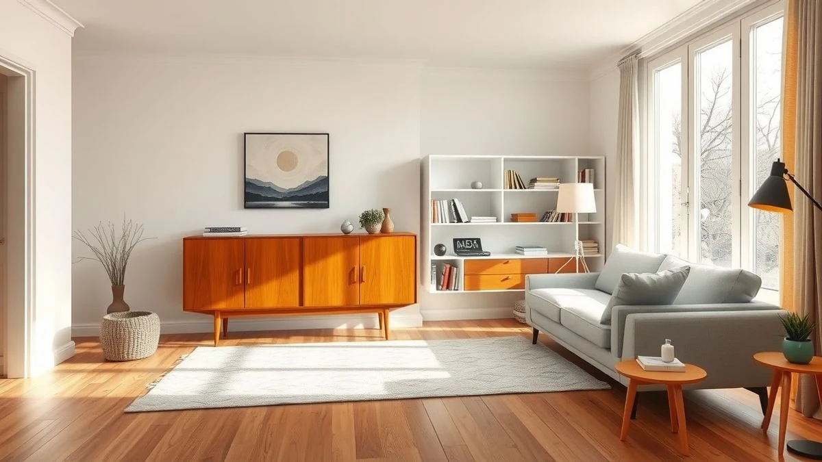
The strongest trend we are seeing is the return of earthy and natural tones with personality. We’re not talking about the boring beige of a decade ago, but rather deep ochres, aged terracotta, and warm browns that evoke nature without losing sophistication. I confess that I initially doubted these colours because I thought they would age the space, but after seeing several well-executed proposals, I’ve eaten my words. The trick is in moderation: an ochre or terracotta wall in the bedroom or living room can be incredibly cosy if balanced with pure whites and natural details.
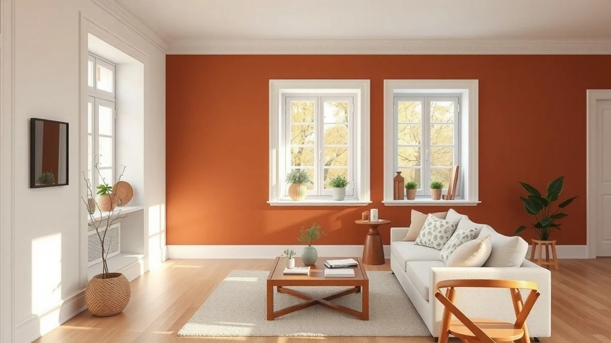
Another colour that will take centre stage is ashen green or sage green, that intermediate shade between mint green and greenish grey that conveys calm without feeling artificial. The beauty of this colour is that it works in practically any room: from modern bathrooms to relaxing living rooms. At Casa y Deco, we have seen how this shade creates environments that invite you to stay, breathe, and disconnect. It pairs wonderfully with light woods, brass, and natural fabrics like linen or cotton.
We cannot talk about colour trends without mentioning deep blue, the navy or indigo blue that darkens to almost look black. This colour has been a luxury wildcard in high-end interiors for years, but in 2025 we will see it in more homes because people are daring to be bolder. It’s ideal for creating accents on headboards, entryway walls, or even ceilings. Yes, dark ceilings: many avoid painting the ceiling a colour other than white, but a navy ceiling in a small room can make it feel infinite if you play well with the lighting.
Warm Tones Making a Comeback
If there’s one thing we’ve learned in recent years, it’s that total minimalism can be tiring. That’s why warm tones are returning, but intelligently. It’s not about painting all the walls dark orange or burgundy, but using them as accent colours in specific spaces. A soft coral on the back wall of the living room, a deep terracotta in the kitchen, a burgundy in the master bedroom: these colours work when balanced with neutral surfaces and good lighting.
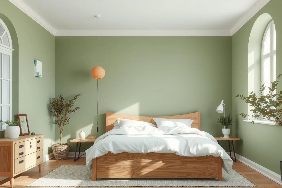
Coral is particularly interesting this year because it evolves into more mature shades: dark coral, toasted salmon, orange corals with earthy undertones. It’s not the bright coral of a decade ago. This shade conveys energy without overwhelming, and works especially well in kitchens or dining areas where we want to stimulate conversation and appetite. Pair it with raw white and natural wood: the result is a space that breathes warmth without being overwhelming.
Reds are also making a comeback, but more sophisticated reds: burgundy, wine, rust red. These colours evoke luxury and drama without being childish or overbearing. A bedroom with burgundy walls, white bedding, and gold or copper accents can be incredibly seductive. The key is to use these shades in spaces that aren’t tiny, as they need air around them to avoid overwhelming.
Neutrals Reinventing Their Role
The return of colours doesn’t mean that neutrals are disappearing. On the contrary: neutral tones are evolving into more interesting and complex versions. Beige gives way to warm tones like light stone, chalk, slightly yellowed cream, or faded linen. These neutrals have texture and depth; they are not flat. Pay close attention to the colour in different lighting (morning, afternoon, artificial light) because some can change drastically.
Grey is also changing its character. Out with the cold neutral grey that looked like concrete. In with warm grey with beige, brown, or even pink undertones. These greys work as a perfect bridge between spaces if you need to visually zone without structural changes. For example, painting the kitchen warm grey and the living room raw white creates a transition without a harsh cut.
Combinations That Work in 2025
Sometimes the perfectly chosen colour fails because its companions are not suitable. Here are combinations we’ve seen succeed that you can steal without guilt. Ochre + pure white + light wood is classic, but add brass or copper and it becomes sophisticated. Sage green + warm grey + natural textiles is the equation for relaxation: ideal for bedrooms or studies. Terracotta + sand + handmade ceramics is inspired by southern Spain and perfect for bohemian bathrooms or living rooms.
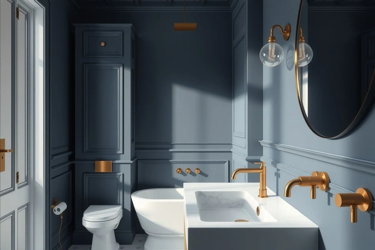
For those daring with deep blues, the winning combination is navy + ivory + matte finishes in accessories. Avoid overstimulation by adding other strong colours; let the blue shine and the rest breathe. And if you want coral or burgundy, pair them with at most one additional neutral (white, warm grey) and natural details: copper, brass, woods, or linen. Textile accessories are your allies here to soften without diluting.
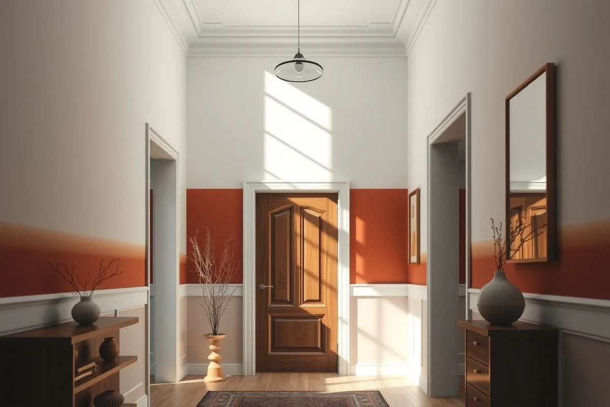
One of my personal discoveries is that two-tone walls are back as a viable option, but executed without naivety. We’re not talking about horizontal stripes like in the 80s. It’s about dividing the wall at half height or three-quarters, combining a darker colour below (terracotta, indigo blue) with a light neutral above (white, stone), or vice versa. This effect visually expands and adds sophistication if the proportions are correct.
Errors to Avoid
The first is choosing a colour without considering natural light. A wall that looks divine in the store under fluorescent light may appear dull or too dark at home. Buy samples, paint large rectangles on each wall, and observe them at different times. The second mistake is confusing trend with personal taste. If a shade doesn’t speak to you emotionally, don’t use it just because it’s fashionable. The third mistake is painting all four walls the same strong colour: the result is a suffocating box. Use accents, combine with neutrals, leave spaces that breathe.
Don’t forget that surface preparation is critical. A beautiful colour on a wall with irregularities or lack of priming will highlight every defect. If the wall was previously painted bright white, it will need priming before any dark colour. Skipping this step is the number one reason a painting project visually fails. Invest in good primer and quality paint: your future self will thank you for not having to redo the work in a year.
The colour trends of 2025 have one thing in common: emotional authority. Whether it’s enveloping terracotta, relaxing ashen green, or dramatic deep blue, the colours that will define this year want you to feel something. They are neither lukewarm nor apologetic. So choose one that speaks to you, take your time to plan the combination with your existing elements, prepare the surface well, and dare to experiment. The best thing about painting is that if you mess it up, you can always repaint. That freedom to experiment is what makes this the most democratic decorative change in the world.

You may also like