At Casa y Deco, we love talking about kitchens, because the truth is that this space greatly influences the comfort of a home. And the U-shaped kitchen is one of those layouts that, if well thought out, can completely change how you cook and how you live at home. It’s not the easiest to execute, but it has tremendous potential: it provides abundant storage, enviable ergonomics, and, if done thoughtfully, it can even look beautiful.
I confess that for years I thought the U was only for large kitchens. I was wrong. The key is to understand that it’s not about having a lot of space, but about using it intelligently. A U-shaped kitchen is fundamentally three walls of storage and work that close in on themselves. This allows you to move in a compact and efficient work triangle, without having to run from one side to the other like it’s a gym.
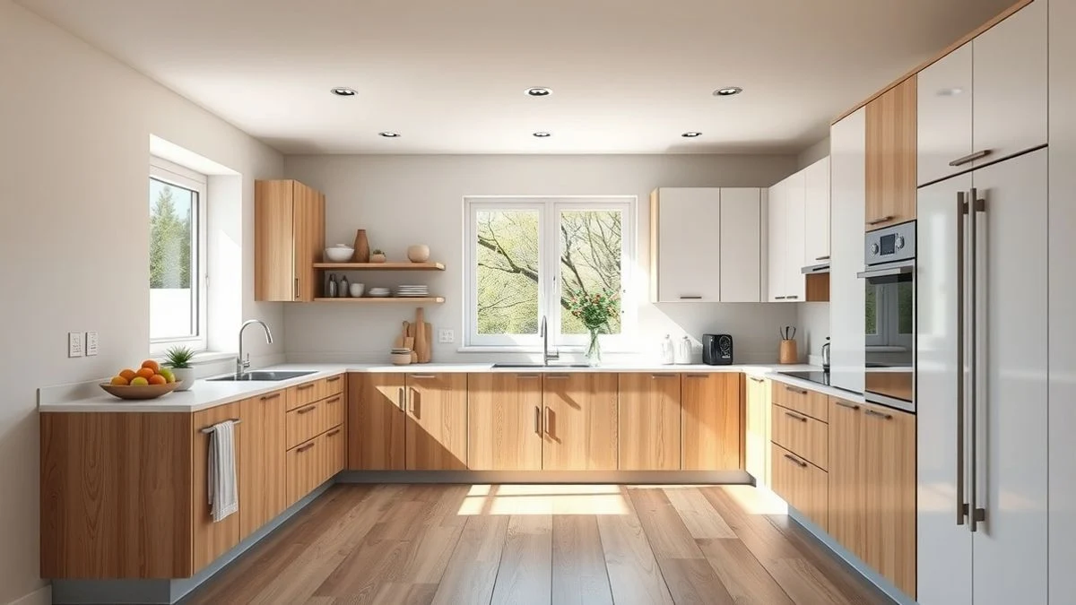
The first thing you have to accept is that corners are your ally, not your enemy. Many people hate corners in the kitchen because they think it’s wasted space. It’s true that an empty corner is a waste, but when filled properly, it’s gold. Solutions like 90-degree rotating cabinets or sliding drawer systems transform those dead corners into functional space. You don’t need sophistication: sometimes a simple wooden or metal carousel that rotates on its axis is enough to access what’s at the back without having to stick your head under the unit.
The second step is to think about measurements. A U-shaped kitchen needs at least 2.10 meters in length between the two parallel walls so that you can open the fridge, ovens, or dishwashers without the doors colliding. If you have less space, you risk creating a claustrophobic or outright non-functional kitchen. If you have more, even better: you can fit a small island in the centre, or simply have more room to move around. My recommendation is that before buying anything, measure the space exactly and draw to scale (no matter how ridiculous it sounds, it works). On graph paper or an app like Planner 5D, place the appliances with their actual dimensions and close the doors. If you see there’s a clash, adjust before spending money.
Storage is where the U shape particularly shines. You have three fronts of cabinets instead of two or one, and that multiplies the possibilities. The most accessible area, between waist and eye level, should be reserved for what you use daily: glasses, plates, pans, spices. The upper heights can be used for glassware, containers with their lids, or those things you take out twice a year. The lower cabinets, under the countertop, are for heavy items: large pots, casseroles, everything that’s heavy and you don’t want to be pulling out suddenly.
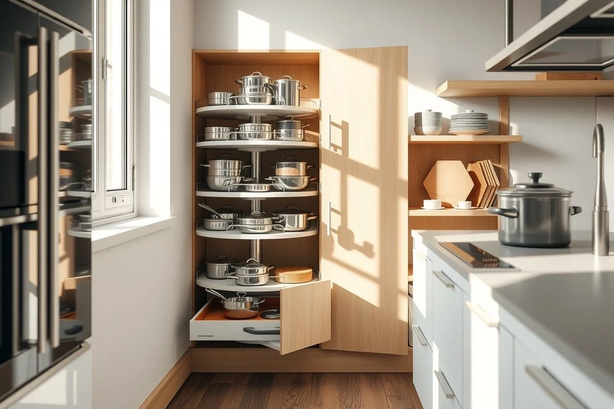
Here comes an uncomfortable truth: if your U-shaped kitchen has shallow cabinets (let’s say, less than 50 centimetres), the cabinets become impractical in their deeper areas. Everything disappears to the back and then you can’t find it. If this is your case, consider installing interior extraction systems: sliding drawers or baskets that bring the back items towards you. Yes, it’s an extra expense, but it’s the difference between having ghost storage space and having real storage that you use.
The U shape also works in your favour in terms of countertops. You have more continuous work space than in a linear kitchen. This means you can do several things at once without constantly moving around. You chop vegetables in one corner, the oven behind you, and the sink beside you. It’s almost a dance when everything works well. However, that flow is only possible if the countertop is clear. Store away appliances that you don’t use every day: the toaster, the blender, those things that take up space and create visual clutter.
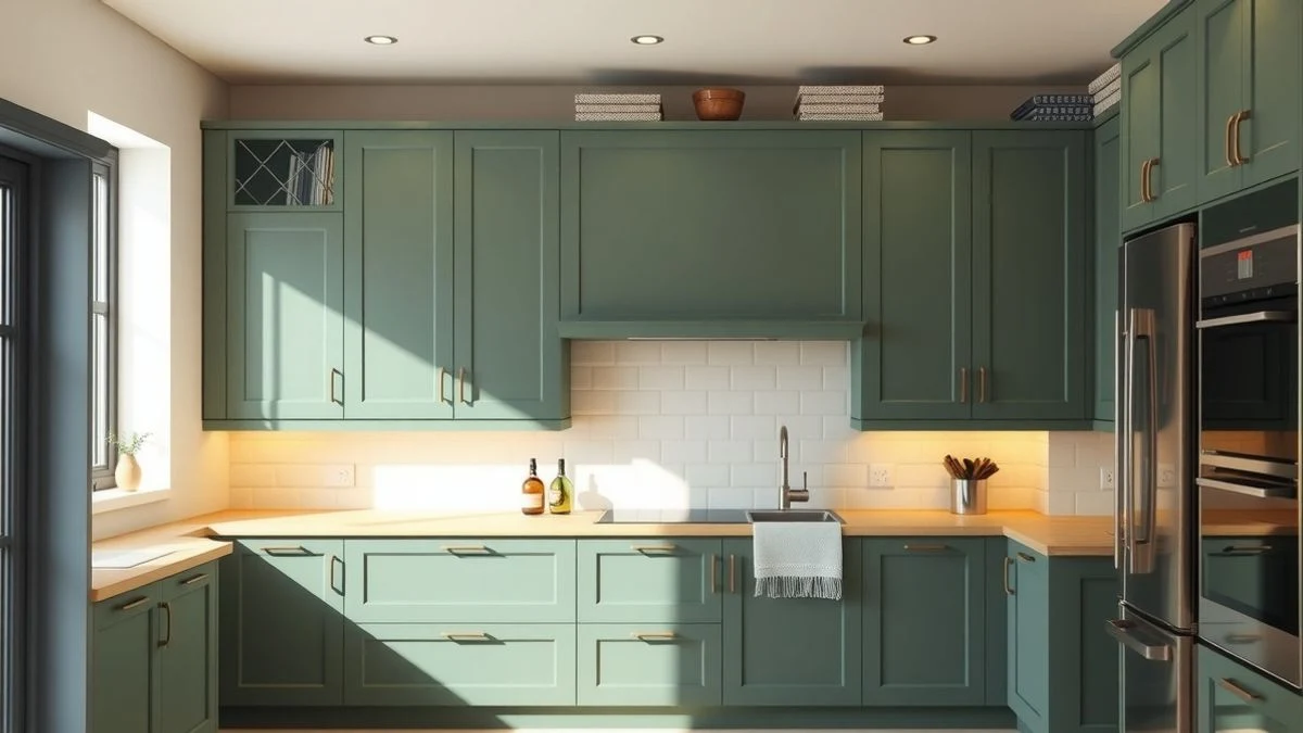
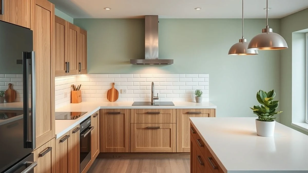
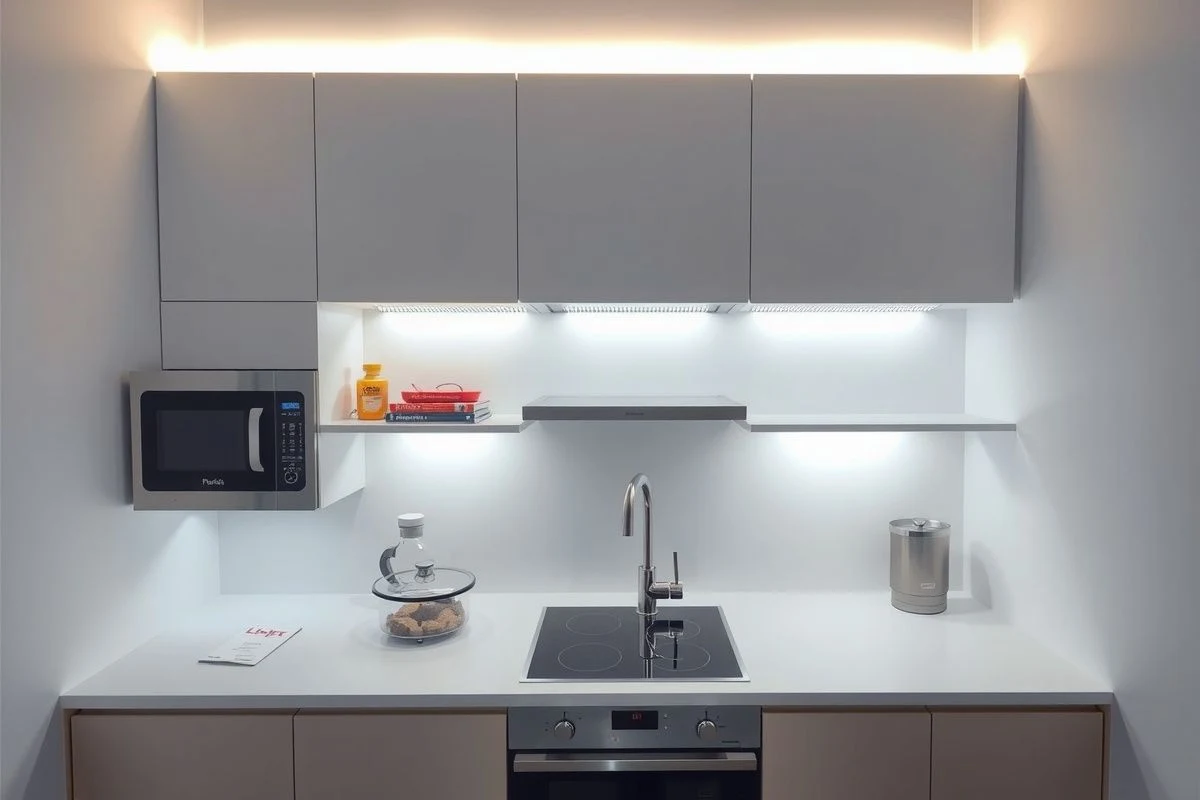
Let’s talk about light, because it’s something that is often left until the end and that’s a mistake. A U-shaped kitchen has corners that tend to stay dark, especially the corners. The lighting should be double: a general overhead light and focused lights under the upper cabinets. The spotlights under the upper cabinets illuminate the countertop just where you need it, avoid shadows, and make the kitchen look larger. If you also add a discreet LED strip under the upper cabinets, you achieve a nice depth effect. Personally, this changed my perception of the kitchen a lot. Suddenly it didn’t look like a cave, but like a space.
Regarding colour, here you have freedom, but with criteria. Light colours in the cabinets make the kitchen feel more spacious, especially if it’s of medium size. Whites, very light greys, or sandy tones create a sense of spaciousness that, frankly, any kitchen appreciates. That doesn’t mean you can’t add colour: a wall in dark green or navy blue works perfectly if the rest of the kitchen is light. Or opt for a coloured cabinet front and the others in white.
The corners deserve special attention in terms of finishing. If you have a protruding corner (that is, where two walls of the kitchen meet), protect it with a corner rounder or an aluminium profile. It’s not just functional, but it prevents those sharp corners from accumulating dust and becoming hard to clean. Rounded corners can be cleaned in two seconds, sharp ones take you minutes every week. They seem like minor details, but they make the difference between a kitchen that doesn’t age well and one that stays clean effortlessly.
Another practical tip: position the sink on one of the shorter sides of the U, never in a corner. Corners are for storage, straight sections are for large appliances. If you put the sink in a corner, you’ll have problems with the pipes, access, and ease of use. The sink needs work space around it. A minimum of 60 centimetres on each side is ideal for moving around easily without bumping into adjacent furniture.
The distribution of cold also matters. Place the fridge on one side of the U, never in the middle. If you put it in the middle, you interrupt the workflow and create a bottleneck in the kitchen. One of the short sides is the most appropriate. And if you have space and budget for an additional freezer, that can go in a corner or in a little-used nook.
Don’t forget the finishing details that make a U-shaped kitchen look planned and not improvised. Continuous skirting boards (without those absurd gaps between cabinets) make the kitchen look cleaner and more coherent. The handles or knobs should be consistent throughout the kitchen, not each cabinet with a different model. The finishes on the backs of the cabinets (never leave a melamine side exposed) give a sense of a well-done project. These are things that cost almost nothing but multiply the feeling of quality.
Finally, I’ll give you one last piece of advice from experience: always leave some reserved space for the future when planning a U-shaped kitchen. Don’t fill every inch with appliances or furniture. A bit of flexibility allows the kitchen to age well and lets you make small changes later without everything collapsing. A U-shaped kitchen is a big investment, and good planning from the start saves you headaches later on. At Casa y Deco, we’ve seen too many kitchen renovations where people regret having crammed too much in. Take your time now, plan well, and you’ll enjoy a functional and beautiful kitchen for years.

You may also like