At Casa y Deco, we know that the kitchen is the heart of any home, and choosing the right colour for its fronts is a decision that will define the character of the entire space for years. This season, the tones dominating the decorative landscape surprise us because they break away from the minimalist austerity that reigned not long ago and invite us to be bolder, more personal, more ourselves in our choices.
I confess that for years I believed that a white or grey kitchen was the only safe option, the one that wouldn’t age, the one that would maintain the value of the house. But the truth is that decorating is a deeply personal act, and a beautiful kitchen is above all a kitchen that reflects who you are and how you live. The colours we will see this season understand this: they are sophisticated yet accessible; trendy but timeless in their essence.
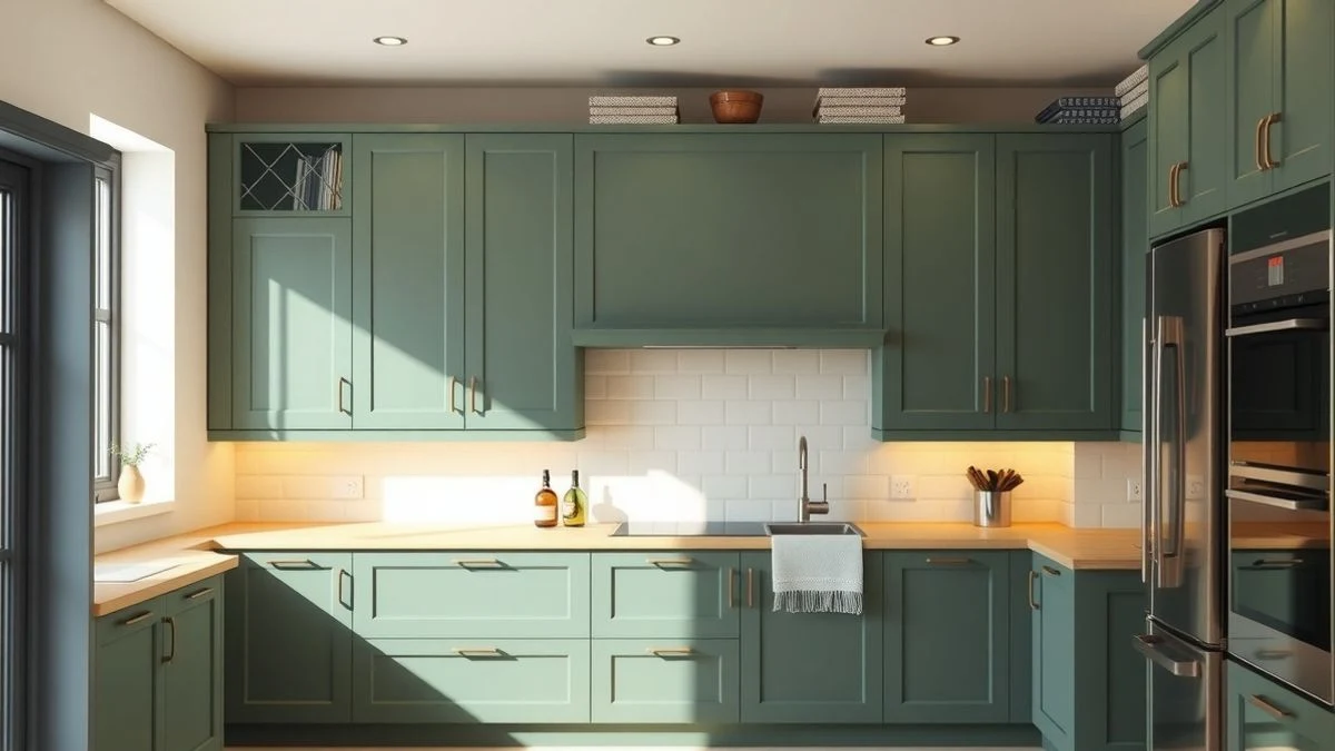
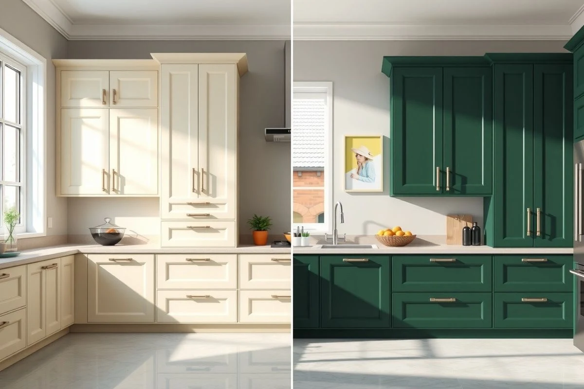
The colour that attracts us the most right now is deep green, in shades that hover around sage green, olive green, and forest green. We are not talking about a garish or artificial green, but those greens we find in nature, with a certain gravity and maturity. This tone works especially well when applied to matte fronts or with textures that organically capture light, creating a warmth that glossy green could never achieve.
The interesting thing about deep green is its chromatic versatility. It combines almost magically with warm woods (oak, ash, walnut), with dark steels and irons, and surprisingly well with some touches of brass or copper that add a point of sophistication. If your countertop is white or cream marble, the intense green will enhance it without stealing the spotlight; if it is dark granite, the duo will be almost theatrical.
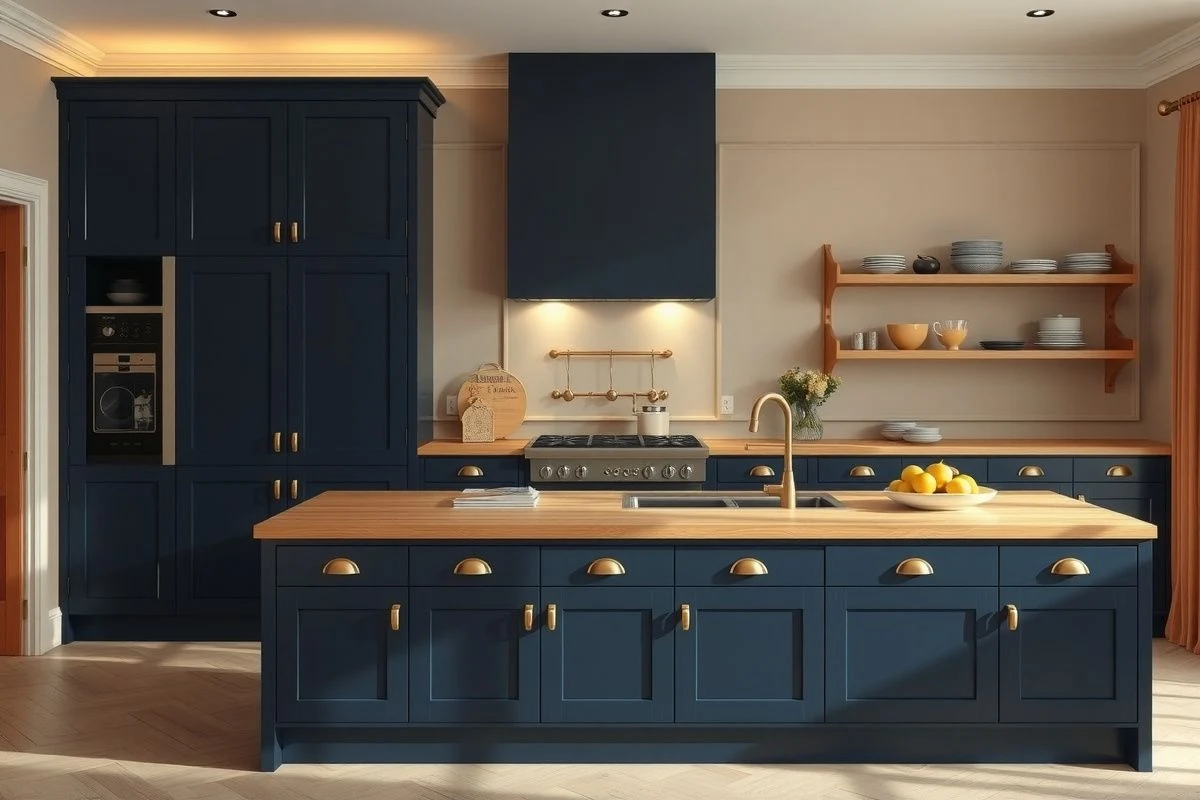
But green is not the only option shining this season. Dark and deep blues—especially navy blue and midnight blue—also have their moment. We are talking about blues that carry a certain melancholy, very different from the turquoise blue of other times or the sky blue we saw so much a few years ago. These are blues that require a certain maturity in their application, but they transform a kitchen into a space almost like an art gallery.
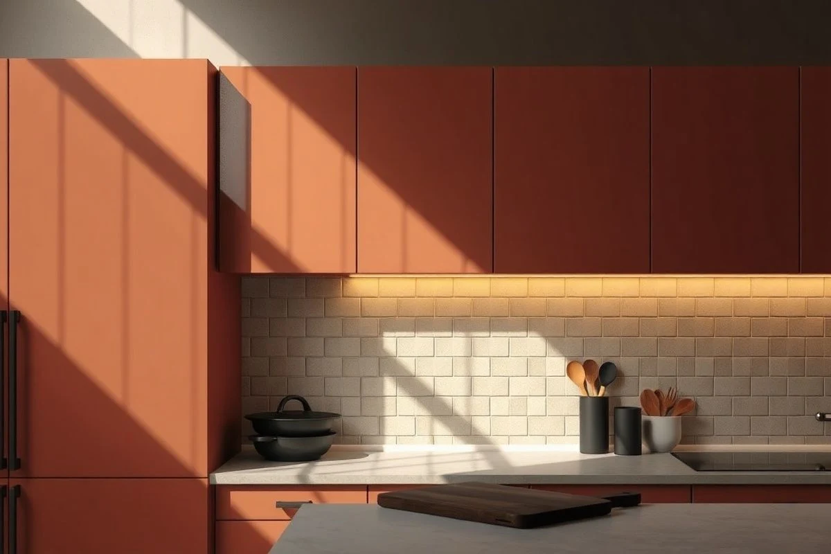
The third colour leading the trends is perhaps the most surprising: terracotta and iron oxide, those warm tones between muted orange and reddish brown. It is not a colour for the timid, but if your kitchen receives decent natural light, it can be absolutely transformative. The key with terracotta is not to be afraid to pair it with bone white details, which create visual breathing space, and with natural materials like cork or ceramics in neutral tones.
The application of these colours requires some strategy. It is not simply about painting all the fronts the same tone and hoping for the best. In large kitchens, over 2.5 meters long, you can afford completely monochromatic fronts, but in tighter spaces, smart distribution makes a difference. For example, one side of fronts in deep green and the other in white or cream not only visually expands the space but also creates dynamism and a certain theatricality that feels very current.
If you have an island, this is your golden opportunity. While keeping the main fronts in a more neutral colour, the island can carry the colour of the season without the risk of overwhelming. A 1.5-meter-long island in navy blue with a light wood countertop is a statement of your taste and decorative confidence. Colour psychologists would say it is risky, but we say it is smart.
Accessories and hardware play a crucial role that is often underestimated. With deep greens and blues, matte pulls in dark tones (graphite black, anthracite grey) work better than chrome. Antique brass will also surprise you: an olive green with old brass pulls creates a combination that breathes quiet elegance. Avoid, on the other hand, shiny chrome or overly modern pulls: they would create a stylistic clash.
Lighting is absolutely decisive. Dark and deep colours need enough light to avoid feeling oppressive. If your kitchen has generous windows, go ahead. But if it is rather dark, consider installing LED lights with a temperature of 3000K or 4000K under the upper cabinets and, if possible, around the island. Light does not make the colour disappear; rather, it humanises it and makes it more welcoming.
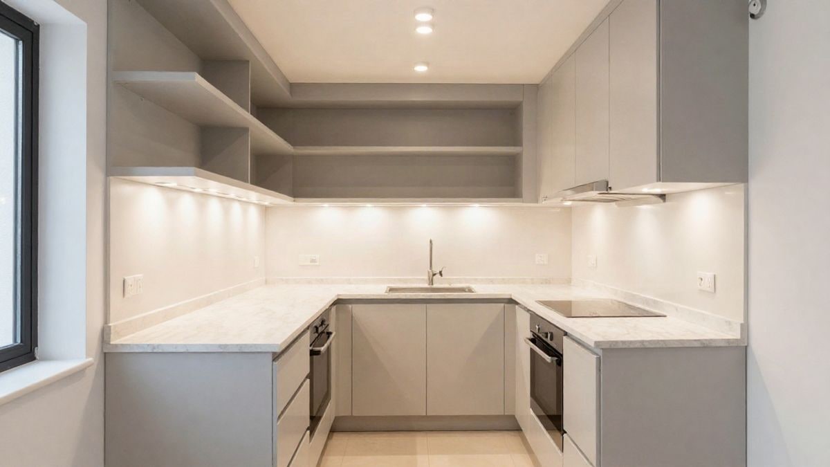
If total commitment scares you, there are intermediate solutions. Panels or a single wall front in the colour of the season, with the rest in white or light grey, offer the best of both worlds. It allows you to experiment, gives personality to the kitchen without being overwhelming, and is easier to change if your tastes evolve over time. Some kitchen furniture manufacturers offer interchangeable fronts, so it is not an eternally binding decision.
Finishes also make a huge difference. The seasonal greens and blues look especially good in matte lacquer or satin-finish paint, which diffuse light more naturally than glossy finishes. If you prefer textures, a front with a soft relief in deep green is practically irresistible: it captures light dynamically depending on the time of day.
A detail you should not overlook: the relationship between your kitchen fronts and the rest of the house. If your living room is Nordic, minimalist with greys and whites, a warm terracotta kitchen front will create a certain dissonance that can work as a visual transition between spaces. If your style is more bohemian or eclectic, these colours fit naturally. You don’t need everything to be coherent to the millimetre, but there should be a dialogue between spaces.
Durability is a real factor. Dark colours show fingerprints, water stains, and dust more than light ones. You will need to clean more frequently and be more careful with spills. If you have small children or are one of those who eats in the kitchen constantly, you may need more patience than if your kitchen is almost a museum where you barely cook. Be honest with yourself about your lifestyle before committing to an intense colour.
What we have learned at Casa y Deco after years of watching trends come and go is that the best colour for your kitchen is the one that makes you feel at home. Trends are an invitation, an inspiration, not a commandment. If this season deep greens dominate but you are more into warm tones, a well-executed terracotta with the right accessories will give you more satisfaction than blindly following fashion. After all, decorating is for you, not for Instagram.

You may also like