At Casa y Deco, we love discovering a colour combination that truly works, the kind you see in a project and suddenly understand everything. Grey and mustard is exactly that: a duo that has transitioned from being a risky bet to becoming the star pairing of modern bedrooms. It's no coincidence. These two colours interact in a way we rarely see: grey brings serenity and sophistication, while mustard introduces warmth and personality without being overwhelming.
The reason for their success lies in the perfect balance they achieve. Grey acts as a neutral anchor that allows mustard to shine without saturating the space. We live in a time where the bedroom has ceased to be just a place to sleep; it is our refuge, our private spa. And these colours know how to do that. Grey conveys calm, that quality we all seek after a hectic day, while mustard — that deep yellow, almost ochre — adds an intelligent warmth, without the aggression of pure yellow.
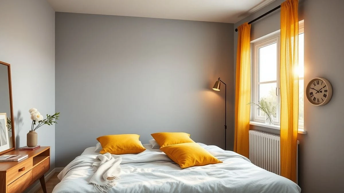
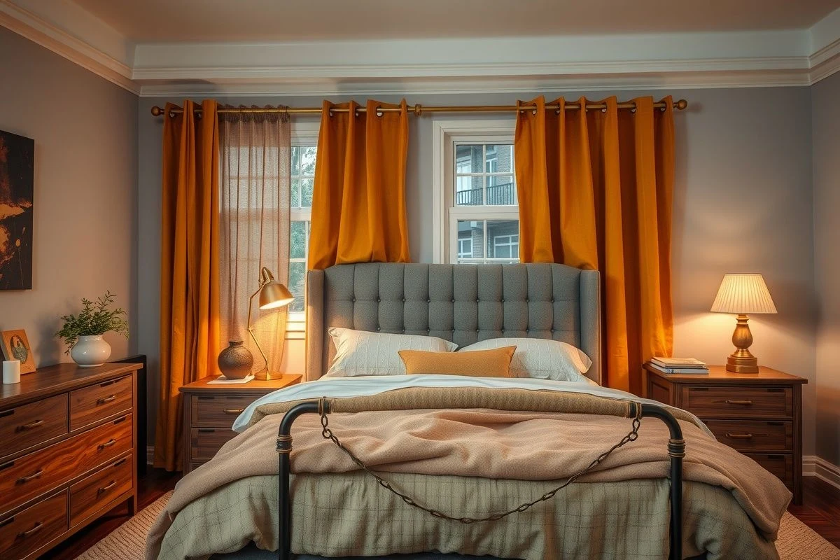
If there's one thing we've learned at Casa y Deco, it's that proportion is everything. It's not about painting the bedroom half grey, half mustard as if it were a primary school experiment. Mustard works best as an accent colour, starring in textiles, secondary walls, or key furniture. Imagine a dark grey wall, mustard linen curtains, and grey bedding with some cushions in that dark gold. That's the magic.
The palette of greys you choose makes all the difference. Not all greys work equally well with mustard. Very cool, bluish greys create contrast but can feel somewhat clinical. We advocate for warm greys: stone grey, taupe grey, olive grey. These absorb the warmth of mustard and amplify it. If your bedroom has limited natural light, a lighter grey (like pearl grey) maintains spaciousness, while with good natural light, you can dare to use a deeper grey that creates more drama and elegance.
Mustard also has its variants, and here comes the advice that has saved us several projects: not all mustards work in all spaces. A more orange-toned mustard (warm ochre) is more sophisticated and versatile, while a purer, cleaner mustard has a more youthful and carefree touch. For a classic or minimalist bedroom, choose the former. For something more eclectic or colourful, go for the latter.
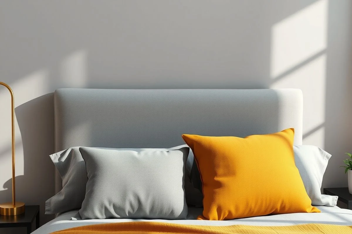
I confess that the first time I proposed this combination to a client, I hesitated. It seemed too theatrical, too "magazine design". But when the textiles arrived — a pure cotton blanket in soft mustard on the bed, linen cushions in grey tones — everything made sense. The space breathed. It was neither cold nor overwhelming. It was exactly what that bedroom needed to go from neutral to memorable.
How to Distribute Colours in the Space
The headboard wall is the perfect canvas to introduce colour. You can paint it in dark grey (a soft graphite grey) and anchor mustard in the textiles there. Or, if you're feeling bolder, a mustard wall behind the headboard (less common, but effective) surrounded by greys on the side walls. The latter works especially well in small bedrooms because the concentrated colour doesn't overwhelm. The other three walls in light grey or cream white maintain spaciousness.
Furniture absorbs a lot of visual prominence, so here’s another golden tip: if you have a strong mustard piece of furniture (a dresser, an armchair), keep the rest of the furniture in grey or white tones. A bedroom with a mustard dresser, grey bedside tables, and a grey bed frame is balanced. One with a mustard dresser, mustard bedside tables, and mustard curtains is chaos. I know the impulse to match, but in decoration, matching is a mistake.
Lighting matters more than you think. A warm light (2700K-3000K) makes mustard come alive, while cool light dulls it. Choose bedside lamps in gold or brass tones that resonate with the mustard. A golden sconce on each side of the headboard is pure gold (forgive the pun). If you have a floor lamp, look for one with a base or shade that dialogues with both colours.
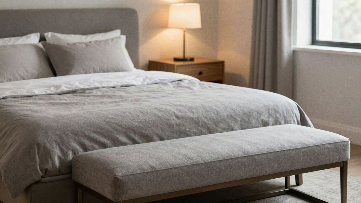
Textiles are where the magic truly happens in this combination. A grey linen bedspread with decorative pillows in mustard, or vice versa. Light mustard linen curtains if you prefer subtlety, or a textured blanket in that tone for the foot of the bed. The tones should be similar in temperature so they resonate together: warm mustard with warm grey, not bluish grey with mustard.
Materials and Textures that Enhance the Palette
Linen and cotton are your best allies in textiles. They are materials that age well, gaining character over time, and absorb these colours organically. A curtain in mustard linen is not a shout; it’s a presence. Synthetic textiles tend to make colours look more garish. If you add wool — an anthracite grey rug, for example — you achieve warmth without losing sophistication.
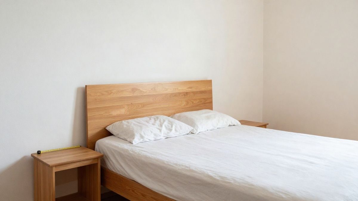
Wood works surprisingly well here. Warm woods (oak, ash) reinforce mustard and create harmony. Light wood furniture in pale grey creates a very clean Nordic effect. If you prefer something warmer, a medium-dark wood (walnut) with graphite grey is practically unbeatable. Cold materials like stainless steel or glass can work, but they need a steady hand to avoid unbalancing the warmth of the combination.
Final accessories are the touch of refinement. Cushions with textures in soft mustard (velvet, jacquard cotton), a mirror with a brass frame that reflects warm light, plants that add green nuances... These small details transform a grey and mustard bedroom from "nice" to "I’d like to be there now". We always recommend keeping accessories in a limited colour scale: grey, mustard, off-white, sage green. More than five base colours and you lose cohesion.
Errors to Avoid in This Combination
The first, and it’s not minor: don’t use mustard intensely in very small spaces without good lighting. A 10 square metre bedroom with mustard walls and little natural light can feel claustrophobic. Here, mustard in textiles, grey on walls. The second mistake is mixing colour temperatures. Don’t paint a wall in bluish grey and then introduce warm mustard; they create visual dissonance that your eye perceives as "something is wrong" even if it doesn’t know what. The third is forgetting finishing details: cold fixtures, a silver mirror frame, or clinical white sconces deactivate all the warmth you had carefully built.

I also confess that there are people for whom this combination doesn’t work emotionally. If grey suggests sadness to you or mustard seemed kitsch not long ago, it may not be for you. Decoration is not democracy; it’s empathy with yourself. But if something in you recognises that it needs that fusion of calm and warmth, this colour duo is your answer. It’s the combination that says you know what you’re doing without needing to shout. And that’s exactly the type of bedroom we all want to rest in.

You may also like