At Casa y Deco, we have seen how grey has become the silent protagonist of any modern home. And it makes perfect sense: it is versatile, elegant, and sophisticated. But here’s the interesting part: colours that combine with grey are numerous, and the key is knowing which ones work depending on what you want to achieve in each space. It’s not the same to seek warmth as it is to seek tranquillity, right?
What we are clear about is that grey is not boring. It all depends on who you pair it with. That neutral tone that seems so discreet is actually a perfect canvas for experimentation. I confess that for years I thought combining colours with grey was complicated, but once you understand how warm, cool, and pastel tones work alongside it, the game opens up completely.
Warm Tones: Energy and Welcoming
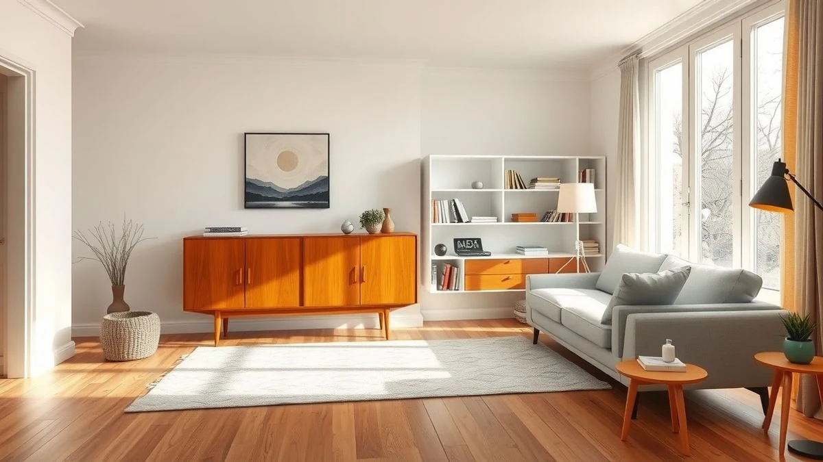
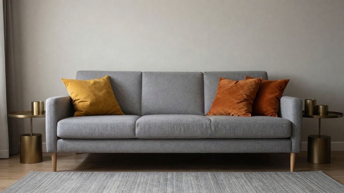
If what you seek is for a space to convey warmth, warm colours like orange, mustard, and terracotta are your allies. Especially when the grey is light, these tones unleash their full potential without being overwhelming. Burnt orange in cushions or a throw on a grey sofa creates immediate contrast; soft mustard on a rug enhances without shouting; terracotta in pots or decorative elements adds that natural touch we all seek.
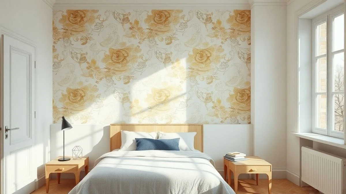
What we love about these combinations is that they work in practically any room. In a living room, they are the perfect solution to break the coldness of grey without compromising elegance. In a kitchen, that mustard yellow in small accessories — a cloth, a handle, a detail — lifts the entire atmosphere. And in a bedroom, if you use these tones sparingly (better in textiles than on walls), they create that cosy refuge feeling we all want.
Pastel: Softness and Serenity
Pastel tones are our favourites when we want a space to breathe. Pale pink, mint green, and sky blue alongside grey create those fresh and bright atmospheres that seem straight out of a magazine, but are actually easy to achieve. A light grey with pale pink in the bedding of a bedroom is simply elegant. Mint green in cushions on a dark grey sofa adds that touch of nature without tiring the eye. Sky blue in the furniture of a grey kitchen: modern, clean, relaxing.
Using medium grey with touches of mint green saved my living room. It’s not loud, it doesn’t dominate, but it gives the space personality. And the best part: these colours work even in small spaces. They maintain the feeling of spaciousness because they don’t visually weigh down like some more intense tones do.
Vibrant Colours: Personality Without Filters
This is where grey proves it can be a champion. Yellow, red, and turquoise alongside it create those character-filled spaces that not everyone dares to create. The key is not to overdo it: these are accent tones, not for entire walls (unless you’re looking for something very daring, which is fine too).
Imagine a grey living room with a vibrant yellow armchair, or a kitchen with a piece of furniture or accessories in contemporary red. Turquoise in cushions or a rug on a grey sofa is fresh, modern, almost exotic. What we are not convinced by are forced combinations where you try to fit too much colour at once. Less is more, always.
Metallic Tones: Accessible Luxury
Gold, silver, and copper with grey is one of those combinations that never goes out of style. It’s not just that it works; it adds that touch of sophistication without needing to spend a fortune. A golden pendant lamp over a grey table or some golden frames on a light grey wall transform any space. Silver is perfect for current minimalism, while copper brings that industrial warmth that is everywhere right now.
The interesting thing is that you can play with the shine. If your grey is very dark, opt for brighter metallics (gold or silver). If it’s light, copper balances everything perfectly. These are details that people don’t always see, but they feel.
Dark and Cool Tones: Serious Elegance
Sometimes sophistication calls for grey with navy blue, olive green, or lavender. Navy blue in a modern grey bedroom is almost poetic: calm, depth, guaranteed rest. Olive green in textiles for a quiet office or living room adds that natural touch without making it look like a jungle. Lavender, so versatile, brings delicacy to grey spaces without being childish if you use more muted tones.
That said: these colours need light. If your space is dark by nature, be careful: they can make everything feel too heavy. Compensating with points of white light or light accessories is essential.
Grey in Every Room
In a bedroom, prioritise tranquillity. Dusty pink and sky blue are safe options; avoid too much contrast. In a living room, grey is the perfect base for an accent colour that defines the personality of the space. In a kitchen, white and light wood with grey create timelessness, although small touches of colour in accessories work well. In bathrooms, grey with white or sky blue tiles is clean; turquoise in towels or accessories adds freshness without exaggerating.
What we have learned at Casa y Deco is that grey is not a final point in decoration: it is a starting point. The real magic happens when you dare to combine, to experiment, to understand how each colour responds alongside it. Some contrast, others soften, others illuminate. But all have their place. The golden rule is one: one dominant accent colour, a maximum of two secondary ones. This way, you maintain harmony without sacrificing style. What are you waiting for to try?

You may also like